.png)


Thank you! Your submission has been received!
Oops! Something went wrong while submitting the form.


Creating and customizing dashboards in Dynamics 365 can transform the way you manage and analyze your business data, enabling more informed decision-making. A well-designed dashboard simplifies tracking key performance indicators (KPIs) and provides real-time insights that can drive your business forward. Whether you're working with the Dynamics 365 for Finance and Operations Dashboard or creating custom views, the process can be straightforward with the right approach.
In this guide, we'll walk you through the essential steps to create and customize dashboards in Dynamics 365.
A Dynamics 365 for Finance and Operations dashboard is a visual tool that displays essential business data in one place. It helps you quickly grasp the current status of your operations, finances, and other key metrics without digging through multiple reports.
These dashboards combine charts, lists, and tiles to present actionable insights tailored to your role or team. Whether it’s tracking cash flow, monitoring inventory levels, or reviewing outstanding orders, the dashboard offers a real-time snapshot to guide decisions.
With relevant data at your fingertips, your business can respond faster to changes, spot trends early, and improve overall efficiency. Customizable dashboards in Dynamics 365 for Finance and Operations allow different departments to focus on what matters most to them, making collaboration smoother and strategies more effective.
Now that we've seen what dashboards can do, let's explore the different types available to match your specific needs.
Dashboards in Dynamics 365 collect important information and show it in easy-to-understand visuals. This helps decision-makers focus on what is essential without searching through many reports, saving time and clarifying complex data.
There are three main dashboard types to consider:
Effective dashboards use the right visuals. Bar graphs compare large data sets well, while pie charts work better for small, categorical data like customer segments. Embedding web resources and adding filters means users can access relevant information quickly, without switching screens.
With these dashboard options in mind, here's how to craft a strategy that delivers maximum impact.
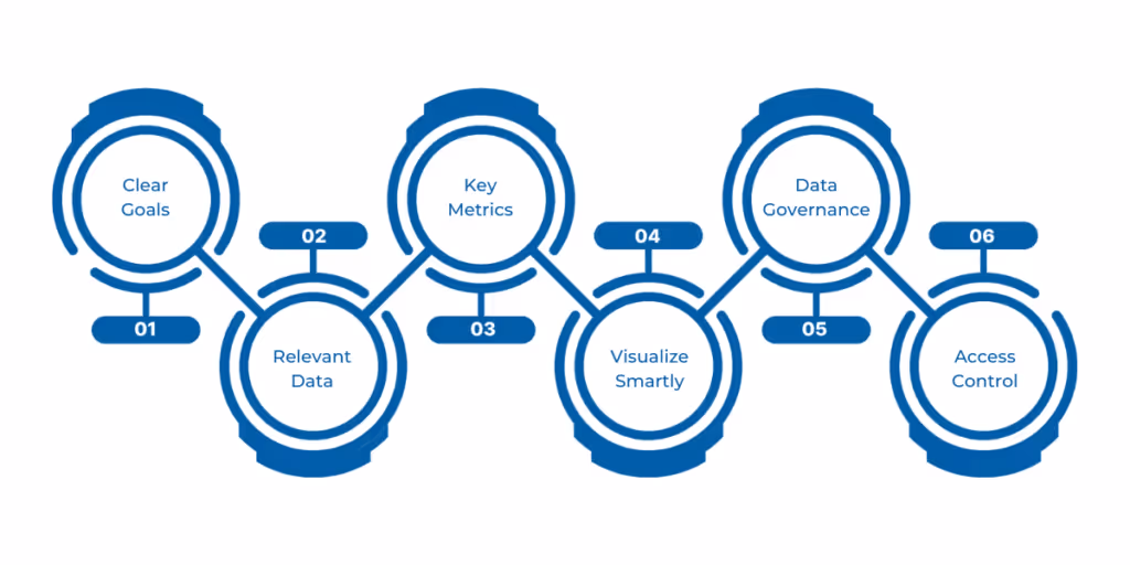
A dashboard is only as good as the plan behind it. If you want your Dynamics 365 for Finance and Operations dashboard to work for you, you need a clear strategy that cuts through the noise. Here’s how to get it right—step by step.
Before anything else, ask, What should this dashboard help me achieve? Are you tracking sales growth? Customer satisfaction? Or maybe speeding up order processing? Pick goals that make sense for your business and can actually be measured. Avoid broad or vague aims. When goals are sharp, your dashboard will stay focused on what matters.
Not all data deserves a spot on your dashboard. Only include what directly supports your goals. For example, if your priority is sales, track revenue, customer orders, and return rates. If you want to improve operations, focus on process timings and error rates. Cut out the extra noise. This keeps the dashboard clean and fast to read.
Metrics show how you’re doing. Pick the few that best reflect your progress. For a financial team, cash flow and invoice processing speed might be key. For a retailer, inventory levels and conversion rates matter more. Too many metrics can overwhelm users. Keep it simple. The right metrics turn your dashboard into a decision-making tool.
How you present data makes a huge difference. Use bar charts to compare sales by region. Pie charts can show customer segments at a glance. Use color to flag urgent issues, like missed targets. Remember, a good dashboard lets users spot problems or wins instantly. For example, a manufacturing firm might use speedometers to show machine performance alongside trend lines for output.
Decide how often the dashboard refreshes—daily, hourly, or real-time—based on how fast you need info. Also, control who sees what. Sensitive numbers, like profit margins, should be limited to senior staff. Others might only need summaries. Proper access ensures security without slowing down information flow.
Not everyone should edit the dashboard. Define roles: who can view, change data, and manage permissions. A sales manager might only view, while a CFO edits financial KPIs. Clear roles protect data and reduce confusion.
Ready to put theory into practice? Follow these actionable steps to build your ideal dashboard.
Cut through the noise - design dashboards that spotlight your critical financial metrics. We break down the exact steps to build your perfect view.
Your dashboard consists of tiles and small boxes showing data points or reports. Here’s how to make the layout work for you:
A dashboard is only useful if it shows the right data clearly.
Not every user needs to see the same information. Dynamics 365 allows you to create role-based dashboards.
For even deeper insights, let's supercharge your dashboard with Power BI's advanced capabilities.
Power BI adds advanced visuals and analytics to your dashboards.
Creating the dashboard is just the beginning. Here's how to refine it for peak performance.
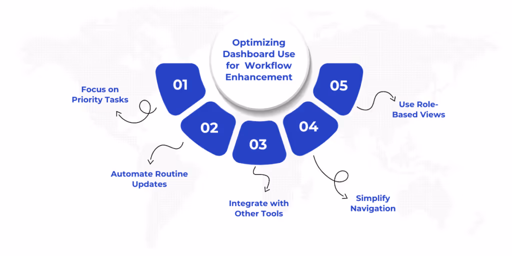
Creating and customizing your dashboard is just the start. You need to use it effectively to improve workflows and decision speed to truly benefit. Here are key strategies to get the most from your dashboards:
A truly effective Dynamics 365 for Finance and Operations dashboard transforms raw data into a strategic asset, becoming the nerve center of your financial operations. When designed with precision, these dashboards do more than display information. They surface hidden opportunities, flag potential risks in real time, and align every team member with the organization's financial priorities.
At WaferWire, we don’t just set up dashboards; we build tailored solutions that fit your unique business needs. Our deep expertise with Dynamics 365 ensures your dashboards provide meaningful insights and real performance improvements. From design to ongoing support, we work closely with you to keep your dashboards relevant as your business evolves.
The transition from data to decisive action begins here. Contact us today to discover how our dashboard solutions can elevate your financial operations.


Creating and customizing dashboards in Dynamics 365 can transform the way you manage and analyze your business data, enabling more informed decision-making. A well-designed dashboard simplifies tracking key performance indicators (KPIs) and provides real-time insights that can drive your business forward. Whether you're working with the Dynamics 365 for Finance and Operations Dashboard or creating custom views, the process can be straightforward with the right approach.
In this guide, we'll walk you through the essential steps to create and customize dashboards in Dynamics 365.
A Dynamics 365 for Finance and Operations dashboard is a visual tool that displays essential business data in one place. It helps you quickly grasp the current status of your operations, finances, and other key metrics without digging through multiple reports.
These dashboards combine charts, lists, and tiles to present actionable insights tailored to your role or team. Whether it’s tracking cash flow, monitoring inventory levels, or reviewing outstanding orders, the dashboard offers a real-time snapshot to guide decisions.
With relevant data at your fingertips, your business can respond faster to changes, spot trends early, and improve overall efficiency. Customizable dashboards in Dynamics 365 for Finance and Operations allow different departments to focus on what matters most to them, making collaboration smoother and strategies more effective.
Now that we've seen what dashboards can do, let's explore the different types available to match your specific needs.
Dashboards in Dynamics 365 collect important information and show it in easy-to-understand visuals. This helps decision-makers focus on what is essential without searching through many reports, saving time and clarifying complex data.
There are three main dashboard types to consider:
Effective dashboards use the right visuals. Bar graphs compare large data sets well, while pie charts work better for small, categorical data like customer segments. Embedding web resources and adding filters means users can access relevant information quickly, without switching screens.
With these dashboard options in mind, here's how to craft a strategy that delivers maximum impact.
A dashboard is only as good as the plan behind it. If you want your Dynamics 365 for Finance and Operations dashboard to work for you, you need a clear strategy that cuts through the noise. Here’s how to get it right—step by step.
Before anything else, ask, What should this dashboard help me achieve? Are you tracking sales growth? Customer satisfaction? Or maybe speeding up order processing? Pick goals that make sense for your business and can actually be measured. Avoid broad or vague aims. When goals are sharp, your dashboard will stay focused on what matters.
Not all data deserves a spot on your dashboard. Only include what directly supports your goals. For example, if your priority is sales, track revenue, customer orders, and return rates. If you want to improve operations, focus on process timings and error rates. Cut out the extra noise. This keeps the dashboard clean and fast to read.
Metrics show how you’re doing. Pick the few that best reflect your progress. For a financial team, cash flow and invoice processing speed might be key. For a retailer, inventory levels and conversion rates matter more. Too many metrics can overwhelm users. Keep it simple. The right metrics turn your dashboard into a decision-making tool.
How you present data makes a huge difference. Use bar charts to compare sales by region. Pie charts can show customer segments at a glance. Use color to flag urgent issues, like missed targets. Remember, a good dashboard lets users spot problems or wins instantly. For example, a manufacturing firm might use speedometers to show machine performance alongside trend lines for output.
Decide how often the dashboard refreshes—daily, hourly, or real-time—based on how fast you need info. Also, control who sees what. Sensitive numbers, like profit margins, should be limited to senior staff. Others might only need summaries. Proper access ensures security without slowing down information flow.
Not everyone should edit the dashboard. Define roles: who can view, change data, and manage permissions. A sales manager might only view, while a CFO edits financial KPIs. Clear roles protect data and reduce confusion.
Ready to put theory into practice? Follow these actionable steps to build your ideal dashboard.
Cut through the noise - design dashboards that spotlight your critical financial metrics. We break down the exact steps to build your perfect view.
Your dashboard consists of tiles and small boxes showing data points or reports. Here’s how to make the layout work for you:
A dashboard is only useful if it shows the right data clearly.
Not every user needs to see the same information. Dynamics 365 allows you to create role-based dashboards.
For even deeper insights, let's supercharge your dashboard with Power BI's advanced capabilities.
Power BI adds advanced visuals and analytics to your dashboards.
Creating the dashboard is just the beginning. Here's how to refine it for peak performance.
Creating and customizing your dashboard is just the start. You need to use it effectively to improve workflows and decision speed to truly benefit. Here are key strategies to get the most from your dashboards:
A truly effective Dynamics 365 for Finance and Operations dashboard transforms raw data into a strategic asset, becoming the nerve center of your financial operations. When designed with precision, these dashboards do more than display information. They surface hidden opportunities, flag potential risks in real time, and align every team member with the organization's financial priorities.
At WaferWire, we don’t just set up dashboards; we build tailored solutions that fit your unique business needs. Our deep expertise with Dynamics 365 ensures your dashboards provide meaningful insights and real performance improvements. From design to ongoing support, we work closely with you to keep your dashboards relevant as your business evolves.
The transition from data to decisive action begins here. Contact us today to discover how our dashboard solutions can elevate your financial operations.